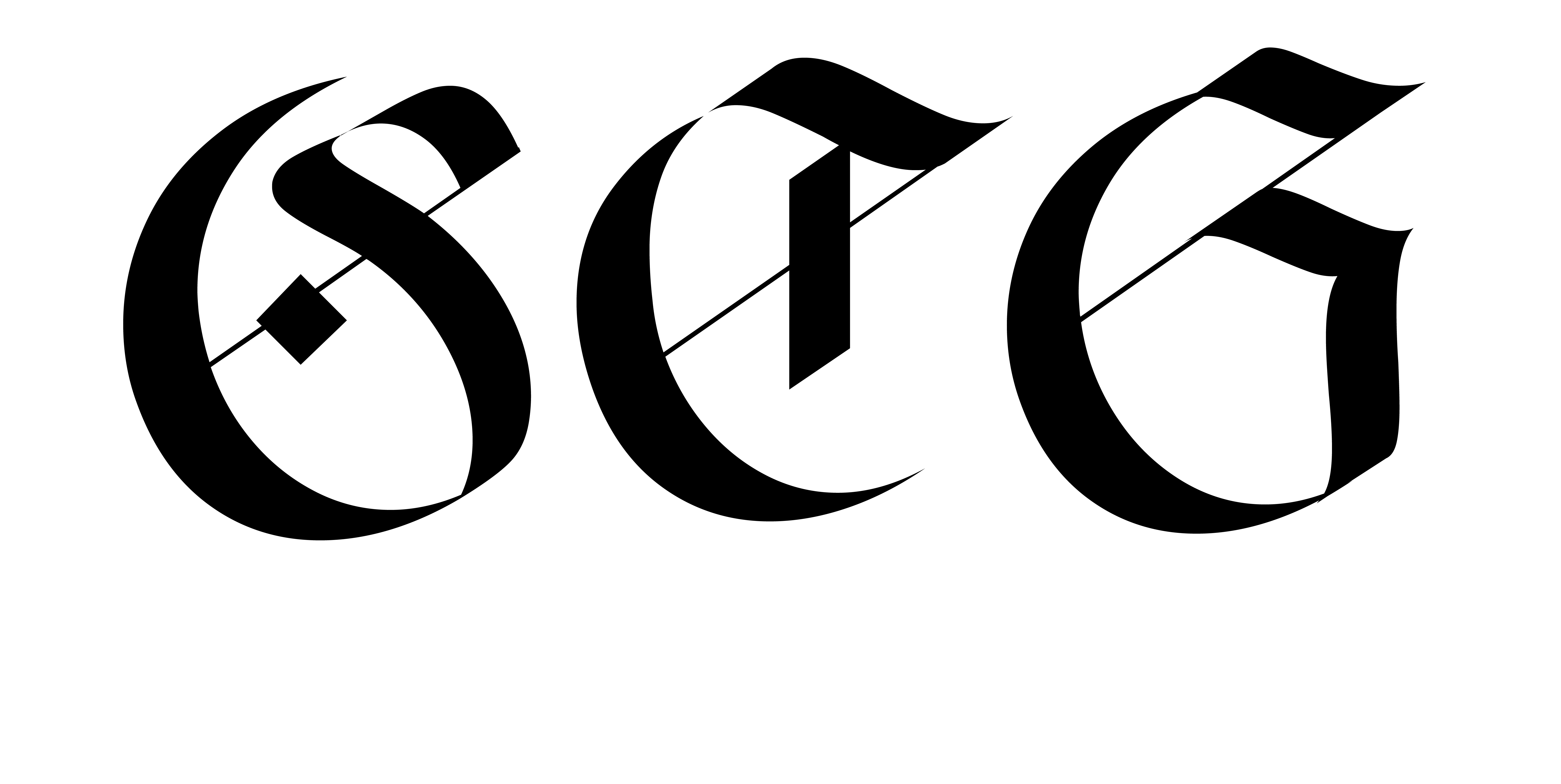
MIJNLIEFF:
a contemporary blackletter typeface
![](https://freight.cargo.site/t/original/i/839954b3f57dbc528aeeb7f15aed1c89b65f1dbf4f184fc43e47a85d98c70f5e/all.jpg)
![](https://freight.cargo.site/t/original/i/17ee65ac3cf685ff2483ccbd08fc54f53b9de9a6448531dc178fa12a79b66fc9/mijnlieff.jpg)
WIP
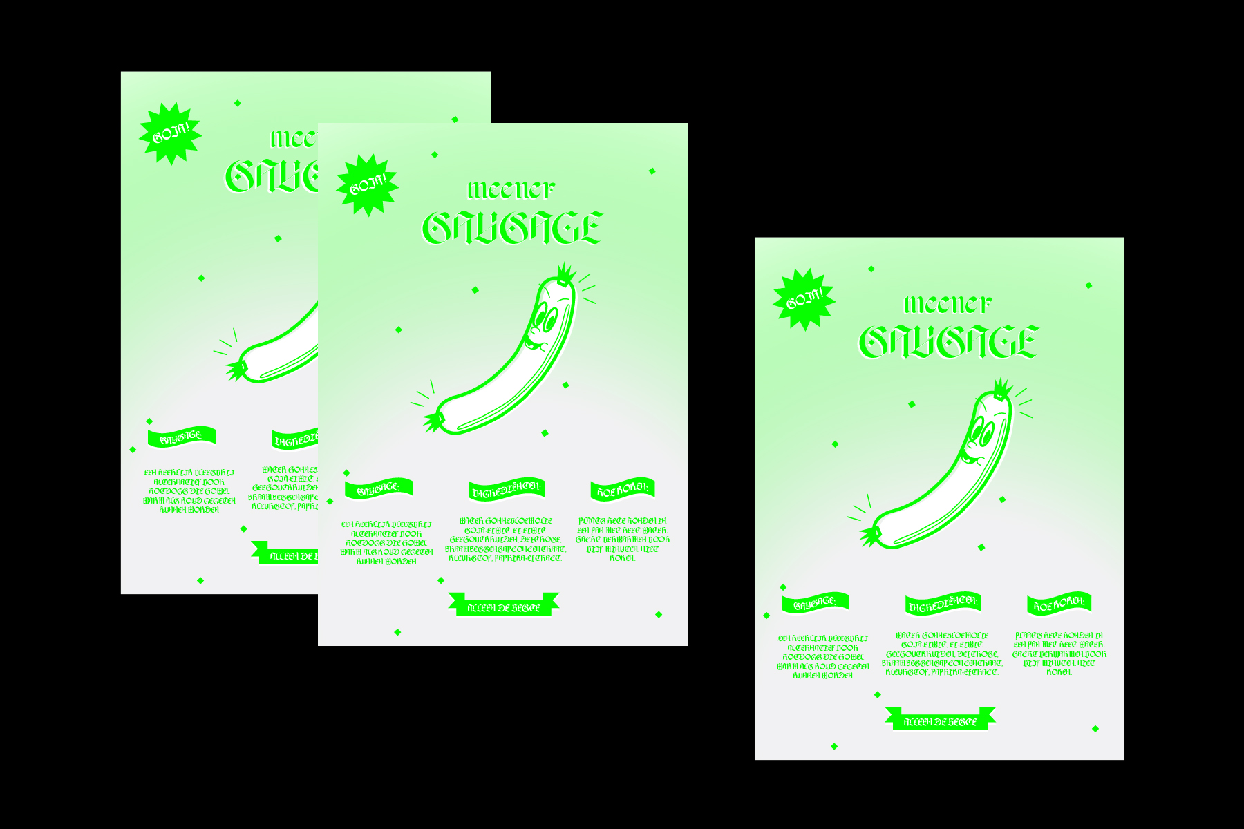
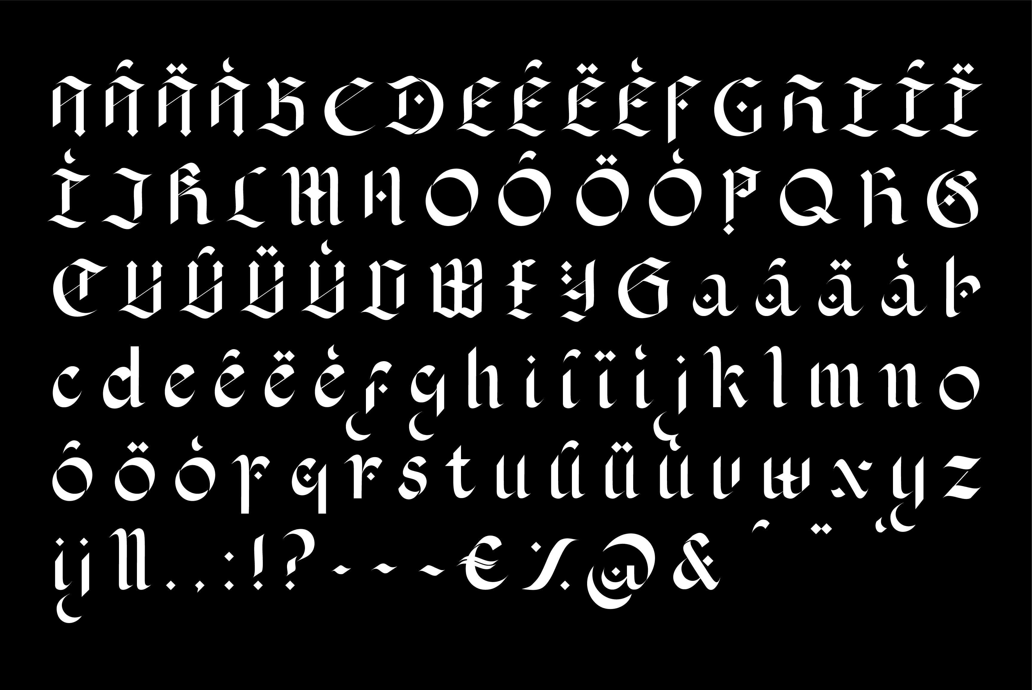
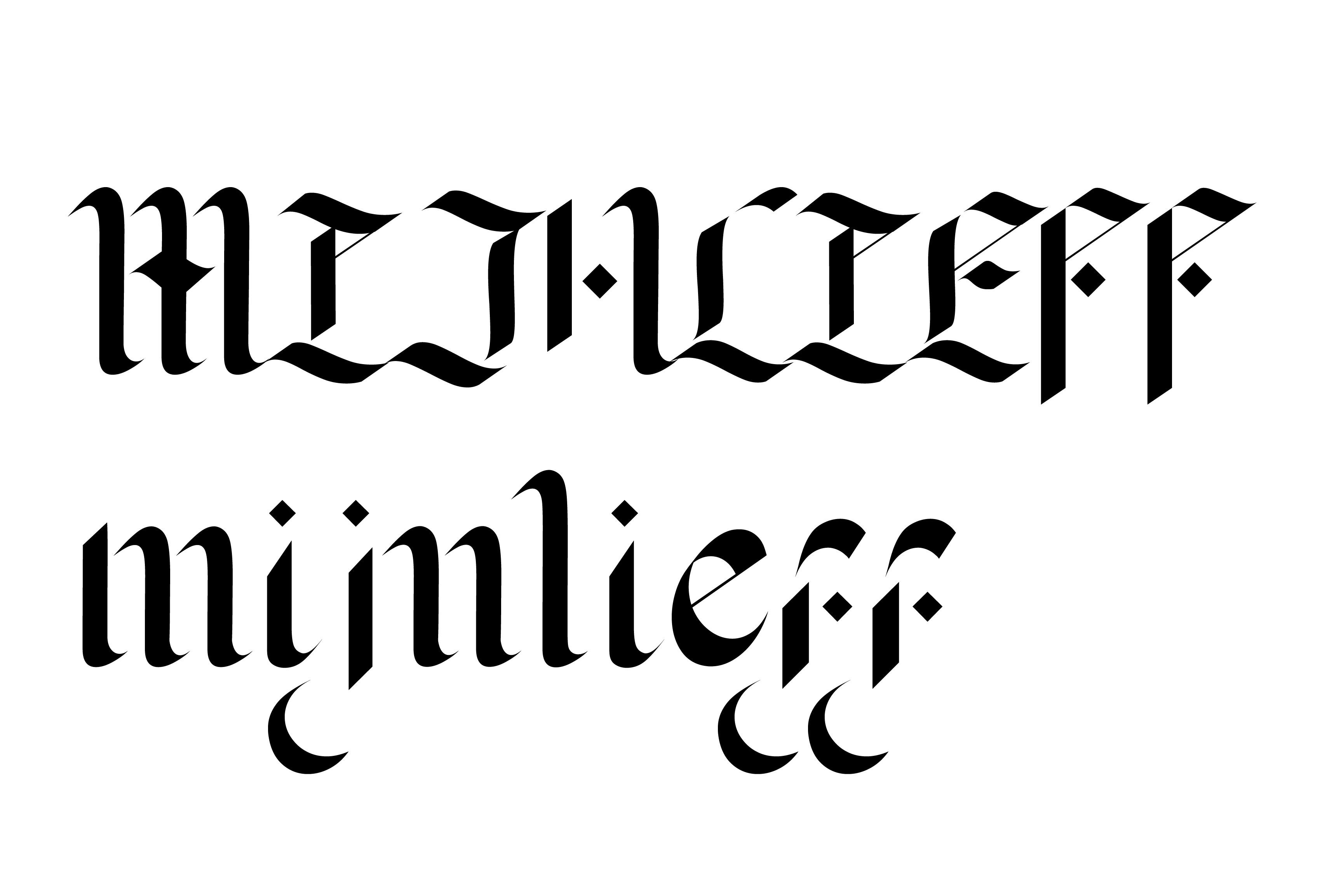
Influenced by traditional fraktur blackletter, mijnlieff puts emphasis on the tension between strokes: where they join, or where they just fail to meet. With hints of modularity, a balance is found between the characteristic embellishment of blackletter, and the aim of a contemporary, digital typeface.
︎
![](https://freight.cargo.site/t/original/i/2b7345dcc4edc778889d9eb984dd7e68b14f56717099e8dc17844a7006397ebb/type-2.jpg)
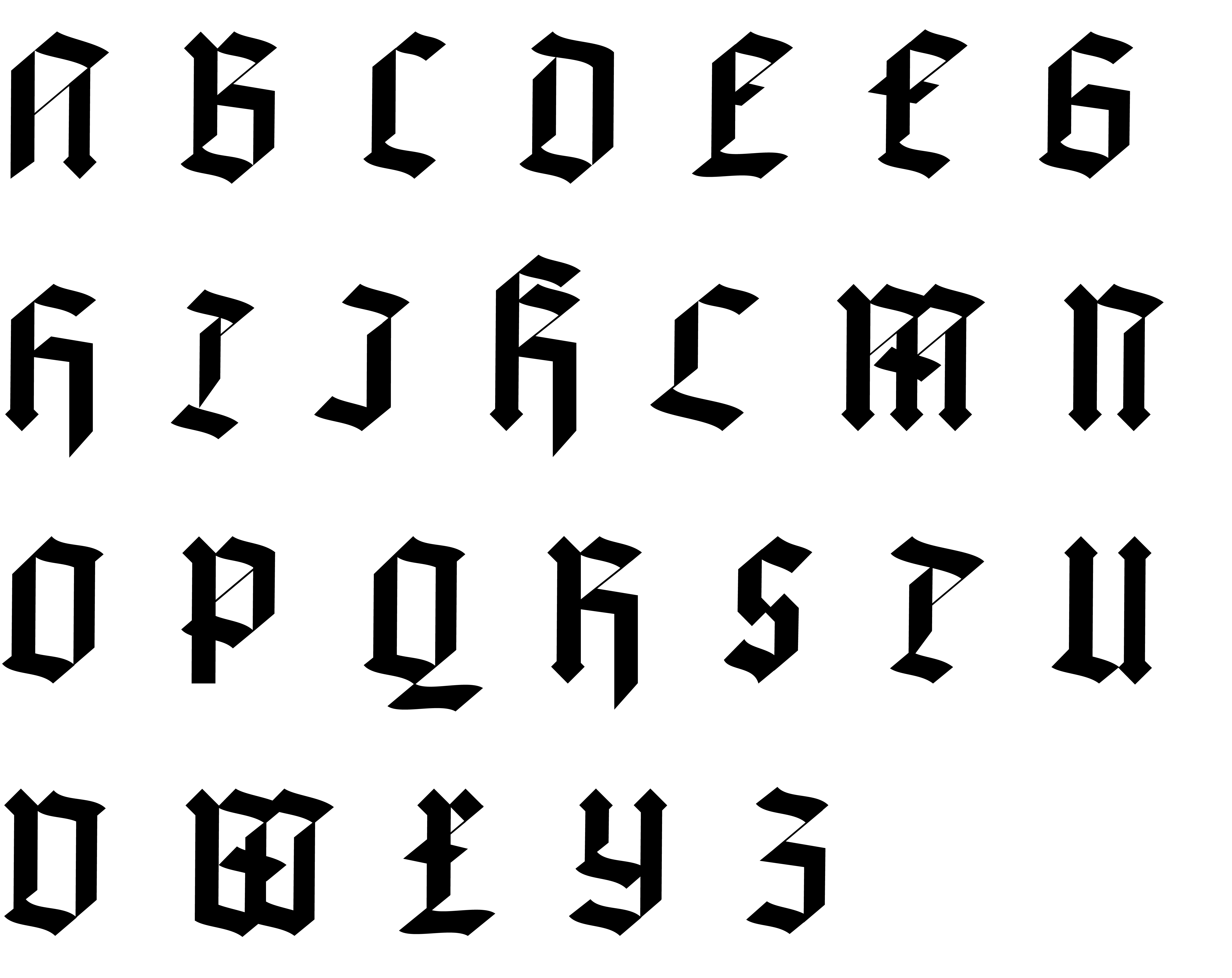
Initial versions focused on modularity: repeated strokes and consistent angles.
In its developed form, mijnlieff loses much of this rigidity, working on embellished letterforms and flow between glyphs.
![](https://freight.cargo.site/t/original/i/17601cd36e1557fa85f86243c51ec5f69ec28186e7fcec8ac7a9fc4cb1501101/stz.jpg)
![](https://freight.cargo.site/t/original/i/2db78def5b8bc423f0f25a614258d011ea3311d12276ccc83fd3079e74a89acd/lieff.jpg)
![](https://freight.cargo.site/t/original/i/808dc733cea721ce4a56ab8662585e02fb376cb19df6fd15c118c95d8eaa4781/posters.jpg)